
Tips and inspiration
Before we start talking about examples of the best Contact us pages, let’s ask ourselves what a standard contact page consists of. You can find phone numbers, email addresses, skype, information about representative offices, photos of offices, a work schedule, a map, a contact form, etc.
Do you think this is enough? Take a look at your analytics and see how many people leave the contact page every month without contacting you.
We hope that our examples of successful Contact us pages will force you to change your traditional idea of the contact page and keep the user on it. The purpose of this article is to tell you that you don’t notice when it comes to creating this page and also to inspire. Inspiration can be hard to find, but the surest way is to look at good examples. Here we have collected the best Contact us pages that have shown their effectiveness. If they could, then you can, and we will help you do it.
The contact us page is a crucial step that the user must go through before contacting you. Therefore, the fate of the leads, approaching the narrow neck of the sales funnel, depends on its design, convenience, and design. How to help potential customers contact you? In this article, we have put together the most striking ways to design a contact us page and some practical tips.
What contacts should you post?

First of all, you need to figure out which contacts you need to post on the site so that it is useful and convenient for your target audience. Why is it important? Because according to statistics, 13% of users are annoyed by the insufficient amount of information on the site. How do you react if you see only the feedback form on the Contact Us page? You probably think that the brand has something to hide. Or that the employees of the company are not very happy and want to communicate with you. In any case, this page was created not to hide information from users, but vice versa. If you do not want to advertise this information, you should not even create a contact us page. But think about how your customers will contact you?
Agree, it is much more helpful to have a choice among several channels of communication with the seller. Maybe by viewing the page, the visitor will stop at the feedback form, write a message, and wait for a response. But this should be the choice of your user.
So, what information should be placed on the Contact us page:
- address of the company and its representative offices;
- working hours and weekends;
- parking information;
- phone numbers;
- email addresses;
- link to Google Maps;
- driving directions;
- links to pages on social media;
- logins in WhatsApp and other messengers;
- photographs of the office, building, and staff;
- contacts and names of managers and employees.
Basic rules for creating a useful contact page

Here, the primary and most effective rules for creating an effective contact page will be described. By adhering to these rules, you can increase the number of orders for your service or product. Let this article be your guide to help you create the perfect Contact us page.
- Write the name of your own company and the main scope of its activities in the heading. The user must quickly understand the site of which company he is visiting. Many users may not be interested in the main sections of the website at all and immediately go to the contact page, therefore
- Indicate the mailing address of the company. The user should easily find this information. The more convenient you post it, the better for you. After all, a larger number of potential customers will be able to find you.
- Do not forget about additional communication channels: use Skype and other instant messengers.
- Provide detailed directions on how to get to the office. Do not limit yourself to simple route planning. Add some panoramic photos to help potential visitors plan the fastest route to your office. Usability experts recommend placing two route options: for those who travel by private car and those who use public transport.
- Add a list of all phone numbers by which you can be reached. Also, near the numbers, indicate the name and surname of the person who will receive the call.
- Try to provide detailed GPS information: car owners will be grateful for such useful information.
- Your email address is no less critical than phone numbers. Simplify the process of sending messages to the user as much as possible and make the links active.
- If necessary, place a feedback form on this page. The feedback form is quite convenient to use: the user can send any questions that arise, without additional transition to the mail client.
- When your company has many regional offices, it is worth sorting the address data and contacts for different regions and cities.
- Be sure to specify the working hours.
List of best Contact us pages
Here you will see only the best Contact us page. Why did we find these pages to be the best? Because they have shown their effectiveness to varying degrees, and are also as convenient as possible for the average user. Look for inspiration in these examples. Perhaps this article will help you create an excellent contact us page for your website.
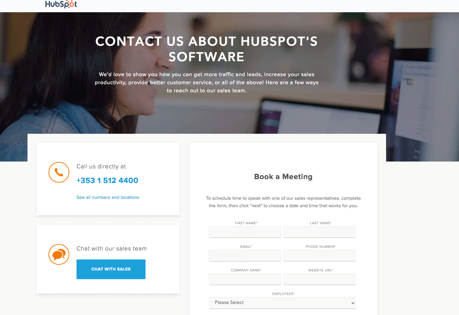
Hubspot

Visit this website to see an amazing example of a user-friendly website. But in this article, we will not talk about the entire site, but focus only on the Contact us page.
The Contact us page stands out for being an excellent example of a customer service tool. At the very top of the page, you see two large CTAs. These two CTAs connect you with support, ask a question, and the sales department, where all the fun happens. Placing buttons at the very top of the page is beneficial for both the company and its customers. The company receives more calls, and it is easier for customers to contact the company. Everyone is happy, but let’s see what’s next.
How cool the contact us page fits into the HubSpot portal is worthy of attention. Such details can inspire. The decisions that were made when creating this page show high efficiency.
Users do not need to leave their accounts to find the support number. It’s comfortable. It looks great. Customers are satisfied, and the company makes a profit.
Pixpa

Take a look at this site and especially the contact us page. Have you noticed anything special? Have you seen anything that makes this site different from others? Everything is simple. On the Contact us page of Pixpa, there is a convenient CTA button. Unlike HubSpot, the CTA button is located at the bottom of the page. This button offers a free version. It looks simple and understandable, and most importantly, the button is visible, among other page elements.
Why pay attention to this button? Why does this button make a Contact Us page special? To be honest, most users do not want to fill out lengthy forms and answer endless questionnaire questions. The average user wants him to be able to access the necessary information with a single click. The CTA button gives the user this opportunity. And more often than not, we need this opportunity on our Contact us page.
Unfortunately, when creating sites, they often forget about the importance of CTA. Do not make this mistake. Always find a place for a button that will give the user quick access without filling out forms. It is for this reason that we put Pixpa in our list of the best Contact us pages.
PeopleMetrics

Looking at the Contact us page of this site, you may be surprised and ask why our agency’s experts decided to put this site on our list of the best? The fact is that simplicity is the key to success. Most often, functionality and information are essential to users rather than the beauty and sophistication of design.
In simple terms, on the Contact us page, the most important thing is not the design, but the address and phone number. The creators of PeopleMetrics took this into account in their work. For this reason, the site shows good results. Using this site is convenient. It is also noteworthy that due to its simplicity, the site looks stylish. Simplicity is one of this year. Keep this in mind and use it in your projects.
Survicate

Pay attention to the heading, which is located just above the form. This headline invites you to discuss your project in a friendly tone. It looks very appropriate.
The Contact Us page of this site looks very simple. Everything is done in moderation. Thanks to this, this page looks great on mobile devices. The site is convenient to use both on a PC and a smartphone.
It is also worth paying attention to all the typical information that the average user expects to find here is located very conveniently. Here you will find the office address, email, phone number, etc. The company also indicated a work schedule, thereby taking care of its customers.
It is worth noting that the primary colors of the site are combined with CTA, which is very convenient and emphasizes the designer’s good work. If you are looking for a great example of the Contact us page, then Survicate could be such an example.
Glossier

This website advertises cosmetics. As we can see, the site has a strong presence of the color white. White color is often used by websites related not only to health and appearance, but also to fashion, art, and literature. White color is an exquisite color, but to make your site look like this, you need to make an effort. Glossier managed to create a fantastic effect. You’ll start to be interested in their cosmetics because the website is incredibly beautiful, and you want to join this beauty. Visit this website to verify this.
Freshworks

This site looks very friendly. A simple but noticeable “Get in Touch” button brings the user to a form that opens in a lightbox. Open it just right now to figure out how cool it is. It is convenient, and, most importantly, clear. Thanks to this lightbox, the Contact us page managed to keep us short, but not to the detriment of informativeness.
If you are looking for details that will make your website memorable, then the lightbox may be what you are looking for. Remember, the user remembers everything unusual well, and forgets everything typical, standard. An experiment is what helps you create a truly useful website. Try different approaches until you find what you need.
Zendesk

Zendesk is a customer service software that focuses on engagement. About 300 million people worldwide use Zendesk. The contact us page has many advantages that are not even noticeable to professional designers and developers. At first glance, it becomes clear that this page is of high quality. But why exactly?
The page looks very minimalistic, which is an absolute advantage. Forms look simple, and accordingly, the user will not be lazy to fill out these forms. Of course, this increases the conversion. That is why the Contact us page of this site fell into our list.
Scribd

Scribd is a popular digital library. The peculiarity of this digital library is that it allows readers to enjoy many books directly from their browser. The Contact Us page of this site is attractive and unique. Let’s take a closer look at how this page works.
At the top of the Contact Us page is the location of this company on convenient Google Maps. You can also easily find their address and links to all your profiles on social networks. Below is an interactive and fascinating map with organized buttons. Users can select the resource they need and chat with the support service. The Contact Us inspires confidence with all its appearance. Strive for a similar result to succeed in your field.
Goals and their achievements
One of the main goals that the Contact us page serves is to build trust among visitors to the organization. The absence or incomplete filling of the page can make an adverse impression on potential customers and make them doubt its reliability.
Before creating a Contact Us page, you need to identify the goals for which it will be needed. But what can these goals be?
For example, one of your goals may be to increase sales. You can also add a feedback form that allows the client to receive a discount on the first purchase when subscribing to the news. Also, using the form, you can advise customers before buying and placing orders. It will be both convenient and efficient.
After-sales service is an integral part of every brand’s work. This includes interaction with customers who want to exchange or return the goods or get detailed advice on its use.
Bottom line

Give Contact us page a little time, and it will already help you stand out among competitors and increase conversion. The number of your customers will increase, which means that the profit will increase. Significant changes begin with small steps. Create a new Contact Us page. Take the first step.
