A website is your 24/7 salesman
It’s also the starting point of all your digital marketing hopes, goals, efforts. And this is why in the modern world of marketing your website is the most powerful tool with huge potential.
The greatest thing about it that your website works for you when you don’t think about its work. It works for you even when you sleep. But sometimes it needs your support, time, energy.
These tips will guide you and answer the question of how to make your website even more efficient to work. If you really use these tips, then you will see how much depends on the little details. The power of nuances in marketing is enormous. And this article is a great proof of that.
There are some UX tips that will make your website better.
Tip 1. The power of white space
Have you ever heard that yellow is the brightest color? That is the reason why our eyes catch this color first and then others. The same thing is about orange. Because orange and yellow pretty similar. Red attracts attention but does it in a more aggressive way. If yellow and orange embody happiness and excitement, red color stands for danger. That’s why this color usually uses for road signs, street signs, etc.
But do you know that it isn’t necessary to use such bright colors on your website to attract users’ attention? The white color isn’t only the most elegant color. Its also has the power of attracting attention. According to statistics, white attracts 20% more attention.
To do this, you need to leave a small white space around the text. It will be as effective as using yellow, orange or red. All the same, it only allows you to keep the style elegant.
Tip 2. Be fast
Modern people usually do a few things at the same time. That is why your potential user can watch his favorite TV serials looking for new goods or service on your website. People expect fast loading of a page that they interested in. But if it isn’t fast enough they just go to another site. Work upon your website’s loading speed if you don’t want to gift your visitors to your competitors.
Slow page load is a little thing that able to ruin all your work upon your cool and modern website. Don’t let users just bounce. If your ‘bounce rate’ is high, try to fix this issue. According to statistics, fast page loading can increase your website’s ‘bounce rate’ by more than 15% and even 20%. This is a huge indicator. But what should you do to get this result?
For the beginning just check your page speed. One of the most common reasons for slow loading is a big size of pictures. Compress all your pictures before you’ll download them to your website. You can use for this purpose special sites. It’s easy and quick. You won’t believe how easy you can increase the ‘bounce rate’ of your website. This point will definitely improve your website user experience.
Tip 3. CTA should be attractive
CTA (call to action) buttons isn’t just functional element. They should look attractive to your users. But how can you make them this way?
For this target, you should figure out how the psychology of colors works. Choose colors for a reason. Read some articles about copywriting. It will help you to choose the right words. Sometimes one word worth more than the whole sentence.
And the most important point is you should think as a website user but not as an owner of this website. There is no doubt about it that all these points make your website more user-friendly, but let’s take a closer look.

Colors
If you don’t know what color to choose, there are some meanings of them that help you to decide:
Green
This color associated with wealth. It usually used to relax.
Black
This color stands for power. It usually used to market luxury products.
Pink
Obviously, this color is pretty romantic. That is why marketers use it in a purpose of promoting products for young girls.
Whatever color you choose, it should fit into the overall style of your brand.
Text
To create great text for your CTA buttons, you should think like a potential user. But what does it mean?

It means you need to ask yourself some simple questions.
- What does your audience look for?
- How can you meet their expectations?
- What would you like to get as a potential user to come back for more?
Be honest with yourself and you will learn how to create great text for your target. Don’t use boring ‘submit’ anymore. A lot of sites have used it. People sick and tired of it. Do something unusual to catch users’ attention. Instead of ‘submit’ write ‘get it with 20% discount’. People like discounts. It makes them feel as if they were lucky today. And if you gift them this lucky feeling they will definitely come back.
Tip 4. Make your links work
for you
As we know nobody likes dead links. And to make your website better you’d probably checked all your hyperlinks by this moment.
There is a rule you have to remember. If something can be improved, it should be improved. Look at your hyperlinks. Do they look good? If you put a hyperlink on your web page, it means you want users to click on it. But how can you increase your chances to get this target?
It’s simple. Underline them. Change the color of your hyperlinks. Make sure it looks obvious that you want visitors to click on it. But always keep in mind that it should look stylish. Any new features you will bring to your website should look good and attractive. Functionality is good, but people won’t use a website that looks outdated no matter what the benefits.
Tip 5. Don’t let the images
betray you
Use images on your site wisely, because any image has its own influence.
It’s not a secret that users don’t like stock images. And that is why you should avoid using them.
Stock images don’t look believable and this is the problem. Worse than stock images could be only stock images that don’t fit your company. But it isn’t hard to find on the Internet an example of such companies who like to use it in the wrong way.
Of course, better don’t use stock images at all. If you are an owner of a website, your content should make your website valuable. It should be interesting for your visitors. But it can’t be really valuable if you just get it from stock.
Dropshipping became ineffective because a lot of people do just the same. They used one type of product, from one supplier, in the same conditions. There was and still is a huge competition. But all these competitors are no different from each other.
The same mistake makes people who get images from stock. They use non-unique content. A customer can saw the same pictures on other websites. And if they did, they will probably lose confidence in your company.
So, does it really worth that? Don’t let the images betray you. It’s only images. It’s your tool, but not vice versa. Make your content valuable. It will definitely bring you luck.
Tip 6. Make your headings
great again
Your message should be simple, clear and, of course, targeted. Make a few variants of it. Spend enough time. But do your best, because a lot of things depend on it.

Your headings and content should be based on what your potential users want. You should know their preferences and wishes. You have to collect some information about them. Use all your knowledge about your visitors when you are in the process of creating content. But headings… just make it simple, clear and catchy.
It’s not a secret that search engines give more weight to headings over other content. You should use it with a purpose. Headings can make your visitors into buyers, but for this target, they should sound cogent.
The art of creating headings
To create it, follow these points:
- Brainstorm ideas;
- Study headings of your competitors;
- Mix it and make it fresh;
- You should have not only an awesome idea but also a perfect wording;
- Without any hesitation use vivid language;
- Include the problem your product solves to your heading;
- Say a strong reason why is your product worth of buyers’ attention;
- Make several variants;
- Ask for feedback.
Tip 7. Consistency is the key
Make sure you keep your site pages consistent. Everything should match. Look at the size of headings. Does it the same on each page of your site?
Your website should be themed. Check the colors and fonts. Is everything in the right place? Buttons and other design elements, illustrations and photos should look organically. This is the way to great user experience, and it still sounds easy, isn’t it?
Pay attention to your navigation panel. Does it look good? Does it easy to navigate on your site? Everything on your website should be simple and clear, and especially the navigation panel.
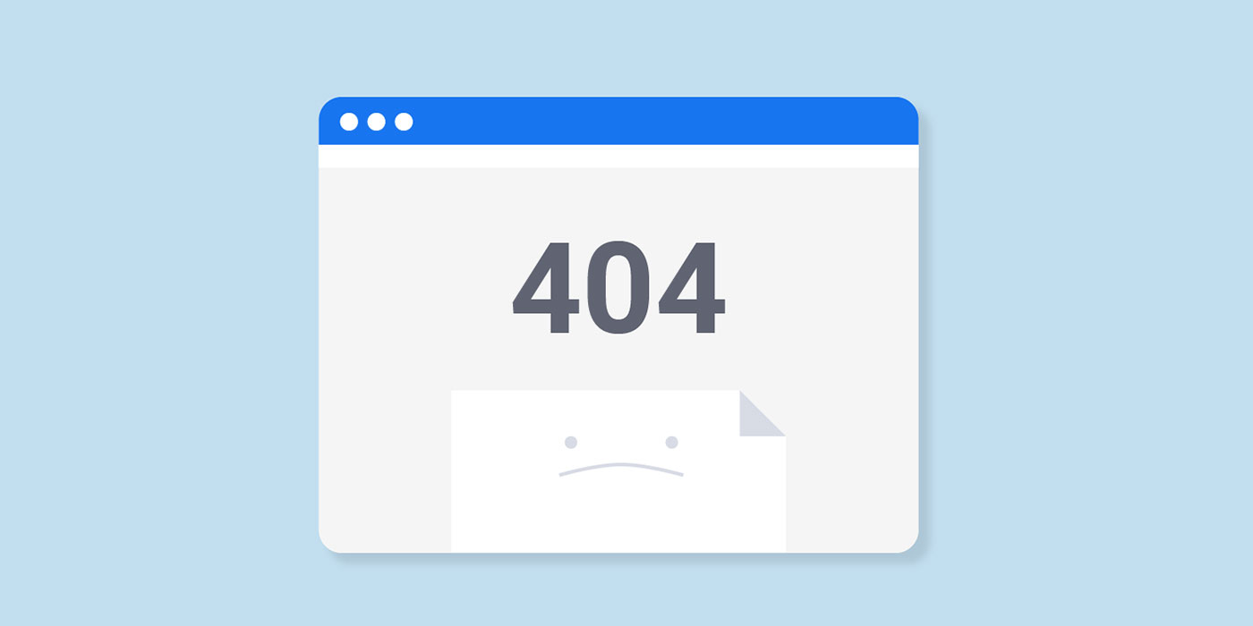
Tip 8. Error 404
Deadlinks and slow loading could decrease the conversion of your site. But the third conversion killer is error 404.

There is a big chance that users will go to another site when they watch this page. And if you can do nothing with it, at least make this page attractive. It could be funny or stylish. But it should be interesting for users. This is exactly the case when you have a chance to make your weakness into a strength. Use it, and your users will appreciate your efforts.
You can use Google Webmaster tools to figure out if you have any 404 errors. Also, you can find some similar tools for checking it. It won’t take a lot of time, but it will give you to make your website much better.
Tip 9. Does your website
mobile-friendly?
Everybody knows that people more often use their phones for searching on the Internet than laptops or tablets. That is why your website should be mobile-friendly. Even better to develop the mobile first. It is extremely important how your site is displayed on different devices. It should be great on small screens and on large ones because you’ll never know which device has your potential buyers.
It would be sad if your buyers will like your website on their phones and hate it when they will find it using laptops. It can be your fatal mistake.
So, draw attention to this step. Modernize your website.
Top 10. How many fields do
your website has?
People don’t like fields. If they see a lot of fields of sign up form, they’d rather choose another website than fill it. Minimize its number. Add autocomplete, if you still haven’t.
Have you ever been too lazy to fill in endless fields? Have you ever felt disappointed after you filled them in? It is this experience of disappointment that repels the modern user from large forms. No one wants to be deceived twice. Think about your users, because this is the only one way to create a website with great UX.

A good site isn’t so difficult to create
The main thing is that you have such a goal. And it depends only on you.
Of course, a bad website can also sell, but a good site will do it better.
The difference between a good and a bad website is how often the developers thought about the user during the creating process. And not only developers, but also designers, content managers, and other members of a team.
Revamp your website. Make it user-friendly. These few tips for effective improvement of website user experience will help you a lot.


