Typography is the voice of design
Much more than you might think depends on the choice of font, its color, thickness, and even size. And especially when we talk about mobile apps.
If typography is the voice of design, then you have a unique opportunity to create a voice that can captivate users.
If your voice cannot be changed, then the voice of your website or mobile apps can simply be changed. And yet, in order to create or modify it, you need to delve into the nuances that will help your project get such a charming voice that users will be willing to pay money only so that it doesn’t stop sounding.
Typographic hierarchy is what you need
The best website is a website with clear navigation. The same thing about mobile apps. Users should easily find what they need. They visit your website or mobile apps for a reason, so your goal is to make it easy to use your product for them.
For this purpose, you should organize your website. By organizing you should understand to make a good structure and highlight key points. That’s why you should pay special attention to typographic hierarchy. It’ll make your website or mobile apps not only more user-friendly but also more stylish.
Where is the source of inspiration? Try to find it in the structures.
A few types of organizing content:
- Headings;
- Subheadings;
- Body copy;
- Captions.
Fonts and audience

A lot of things depend on a font you use for your website or mobile apps. There are a large number of fonts that create a totally different mood. That’s why you should know your target audience to choose the right kind of font.
There isn’t a good idea to use funny fonts for a website dedicated to business topics. Also, you shouldn’t use serious fonts for a website about teens’ life.
If each font gets its own mood, you should learn how to use it in the best profitable way. Fonts of your website should reflect the main message you want to share with your audience. Take your time and try to find your perfect font because it really exists.
Mobile typography
Mobile typography isn’t so easy as you can think. Designers often experiment with typography. But why do they do it?
If you ask yourself this question, the importance of typography becomes obvious. But now let’s delve into a mobile typography.
When it comes to smartphones, it’s important to remember about the font size.
The font shouldn’t be too small, because then it’ll become unreadable. Also, the font shouldn’t be too large, because then your site won’t look stylish. Typography is what make you nervous but this article will help you to overcome it. This will be a plus if in the settings the user has the opportunity to change the font size on their own.
You also need to pay attention to contrast. Pay attention to this point of mobile typography. The text should be clearly visible and readable. If your text looks beautiful but it is difficult to read, then you need to change something, because the value of any text isn’t in the design but in its content.
Also, make sure that the font size of the links and buttons is convenient enough so that the user can click on it. Otherwise, it’ll cause certain difficulties, which will lead to the loss of traffic.
These are just the basic nuances that you shouldn’t forget to make a good website.
Single font
Using just one font is a good idea. You can simply use a different size for headings. If you choose only one font, your website will look more harmonious and accurate. If you have several different fonts, then there is a chance that the site will look fragmented.
Unfortunately, the choice of fonts isn’t given due attention. A lot of people think that mobile typography isn’t so important. Alas, they are wrong. But you must admit, it’s much easier to choose one font for your website than several. This approach has many advantages. Use them. It’ll make your site better, it’ll allow users to better perceive content, and without a doubt, this is the key to success.
Line Length and Spacing
Use these parameters of mobile typography wisely, because the perception of the text by users depends on this. Don’t use more than 35-40 characters per line in the mobile version. This will make your text more readable.
Also, use the space between paragraphs and lines. Using empty space is an important technique that also makes your site or mobile apps more stylish and helps highlight some fragments.
Let’s talk about contrast

Due to the fact that the smartphone screen has a sufficiently small area, especially in comparison with a tablet or laptop screen.
The small screen size of the smartphone that creates increased contrast, which can be difficult to read from the screen. Therefore, you need to pay special attention to such a nuance as a contrast. Don’t make it too bright, avoid the variety of colors. Black text on a white background is always convenient and beautiful. Should you experiment with this?
Heavy vs Light?
It’s not always necessary to choose, even if you are given a choice. This is exactly the case when we talk about such a concept in typography as a font-weight.
You don’t need to choose, instead, you can use different weights in different cases. Use heavy fonts for headings and the most important parts of information. Alternate weight, thereby adding more wash. If typography is the voice of design, then give that voice the opportunity to speak.
Background and its importance
Always remember what color the background of your site is. This is extremely important because sometimes it can prevent the user from perceiving the text.
Make sure that the background color doesn’t match the font color.
The bright background is a common mistake. Don’t use a bright background, because it distracts the user from the content. Or if you decided to use it at least try to test it. This is as important as alignment.
Think like a user to make a user-friendly website easy to use. Choose neutral colors for the background. Let content be your advantage, not design. Good design helps to perceive information and not vice versa. Remember this, and then you won’t have any special problems.
Mobile version

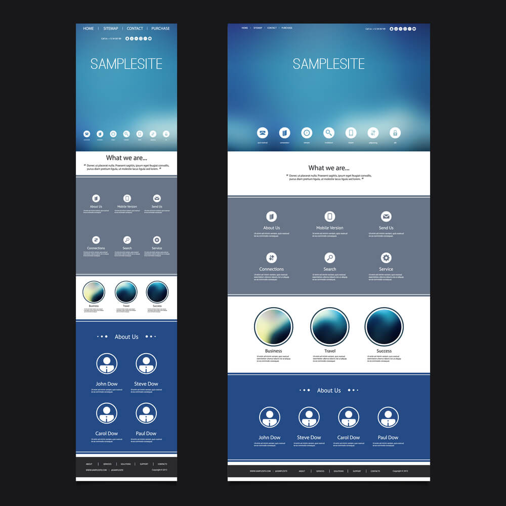
Pay special attention to the mobile version of your website. Use responsive design or mobile-first. This will give you a definite advantage. It’s no secret that Google is ranking worse websites that don’t have mobile versions. Make sure that the font size and other parameters change depending on which device the user is using.
Make sure that the mobile version of your website is in no way inferior to the full version, which is available for use from a large screen. The font should be equally readable both on the small screen and on the large one. In this case, typography is pretty important. Naturally, it should change automatically, and the user himself shouldn’t even suspect it.
Try to make the mobile version such that all the functions that are available from the computer are accessible from the smartphone. Don’t limit your users. Now there is too much competition, and only the best, most convenient site can occupy the top lines of search results.
The Page Text-Heavy
Look at the entire page of your website. Evaluate how harmonious it looks. Don’t allow the page to be too heavy. To do this, you need to go back a few points above and remember the use of space. This technique will help you reduce page weight.
If the page of your website contains too many elements, selected text, blocks, etc., then you should think about how well you thought out the structure of the site. Maybe it’s time to change something.
But how to estimate page weight? You will need some good examples of this. You can easily find them on the Internet or turn to specialists who will share their experience with you. In design agencies, they will not only help evaluate the resulting site but also give tips on how to improve it. Often, in order to get a stylish site, you need to change just a couple of nuances, but it is precisely in these nuances that the feature lies. Only a person with experience can notice this feature. Do not be afraid to contact a design agency, because they have experienced, and you have a desire to create a site. So why not team up to achieve a better result?
Better than it was

Do you still think that mobile typography isn’t so important for your website or mobile applications? Try to use our tips to get an amazing result and this result will be the strongest prove that mobile typography is what makes your mobile app better.
Make global web better. You are able to do it. Yes, you totally are.


