Home page and its value
The main page of the site is one of the most important pages, which is responsible for everything. But what exactly can the home page be responsible for? Firstly, it is after visiting the homepage that it will be decided whether the user will remain on the site, whether he will like the website as a whole, whether his offer will interest him from your company and whether he will be interested in the company itself.
For these and other reasons, the main page has a huge responsibility. The first impression of the entire site and the user’s desire to stay on it or leave depends on it.
Now that you know about it, once again look at the main page of your site and think about whether it creates the impression that is required of it? Will your potential buyer want to stay on your site after browsing the homepage? Would you like to stay if you visited a homepage with such design and content as yours?
Being what any website starts with, the main page performs several key tasks.
Informational
makes it clear to the user where he got to, what exactly the company does, what it offers.
Guide
using the menu, navigation, and active buttons, it allows the user to quickly navigate and navigate the site in search of information of interest to him. This makes the site simpler and more understandable for a person, which is a great advantage because no one will waste time to understand how your site works. The user wants to visit the site and use it immediately without additional instructions and explanations.
Selling
increases trust in the company by demonstrating its advantages, benefits for the user, as well as high-quality advertising of basic goods or services. This is very important, although you yourself know about it because it helps you to earn money.
Communicative
It allows you to interact with customers using integrated social networks, an online assistant function or feedback form. The list does not end there, but this is already quite enough, isn’t it?
In fact, the homepage performs the tasks of the landing page. It should have a logical and selling structure and other conversion elements. The only thing that distinguishes the main page from the landing page is the greater amount of content and functionality, as well as the fact that the site does not end only on the homepage.
Of course, these are only the main points that you should pay attention to and which you need to remember.
What should be on the main page of the site?
Here you should put all the basic information about your company, but this basic information should be as concise as possible. Also, place convenient and intuitive navigation on the homepage. Place the logo here, because it will make your site recognizable. At a minimum, this will help to achieve recognition. All these requirements are relevant for all sites, regardless of their purpose.
What do they offer me?
The answer to this question should be visible to the consumer in the first fractions of a second. It doesn’t matter whether it’s a large website with hundreds of pages or a small resource designed to sell several services. Make the user immediately see what is being offered to him. Take out the main offer in the visual part of the page. If this is an online store, then demonstrate a few products or a catalog. When a person visually perceives a product, the question immediately arises of how much it costs. Why not provide him with this information?
Do not forget about the convenience of the site. If it is large, then it is impossible to provide data on all goods and services offered by the company. Therefore, it is necessary to work out the navigation so that it is convenient for the user to browse through the categories and find out what he can acquire using your resource.
Why should I trust you?
At the sight of the Coca-Cola logo, the user already understands that in front of him is a famous, time-tested company that produces delicious drinks and products. In the meantime, your brand cannot speak for you, it is necessary to create conditions for your potential client to build confidence in you. Blocks of advantages will help in this, where you can tell how your company differs from competitors, a block of benefits with information about the values that the consumer will receive when he becomes a client, as well as blocks of trust and guarantees. For example, customer reviews, company ratings, etc.
It is important to arouse the visitor’s feeling that he is facing a reliable company that is performing its work efficiently and responsibly. A company that you can trust your money. Therefore, all the information and information that strengthens the brand of the company should be on the homepage.
What to do next?
The visitor decided to get to know the company and its activities closer by looking at the site in more detail. Do not force the consumer to look for ways for his further action, give a hint on what to do next. Place navigation buttons that help the client navigate to another page. These buttons should be on each page for a convenient transition between them. Create the necessary links if you want the user to be comfortable using the site and not want to leave it.
What to place on the main page of the site?

Obviously, if you are reading this article, then you have repeatedly asked yourself this question. Alas, there is no single layout of the main page of the site. There is no single structure and content so that it can be said that this particular option is universal and ideal. Each homepage is unique, how unique your business is. It should correspond to the target audience, speak the same language with it, allow the user to feel confident and comfortable, making it clear what awaits him on this particular site.
In order to accurately answer this question, you need to know your target audience well. A lot depends on this factor. You need to know the age, gender, location, average earnings and much more. With this knowledge, you can easily choose the general style of your site, and what tone you need to choose in order to communicate with the target audience. The wider your target audience will be, the larger your earnings may turn out to be.
At the beginning of the era of site building, when they still did not know how to analyze the target audience, did not consider the psychology of a person and his perception of information, homepages often looked slurred and repelled by many factors. Now everything has changed. The main page, which simultaneously considers the needs of the target audience and reveals the company’s business, is a brief preview of the entire site. This helps to immediately interest the visitor in the content of the site and help him as quickly as possible to move into the category that he needs. And although there is no single structure and a common list of elements that should be present on the site, we will still highlight the main ones.
It is important to make a note here. Depending on the type and purpose of the site, the needs of the target audience are different. Therefore, the content of the main elements will be different.
The list of best website homepage design examples
Here you will find a list of best website homepage design examples. Our team selected the most striking examples of homepage design. If you yourself are working on creating a homepage design, then it will be extremely useful for you to familiarize yourself with this list.
Airbnb
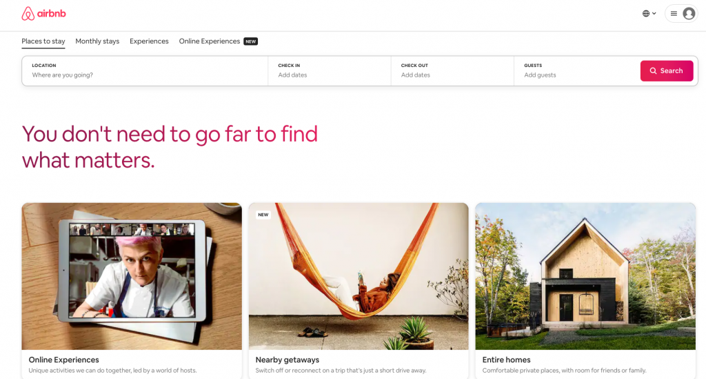
This is one of the most successful versions of the homepage. Let’s see why this is so.
This homepage includes a search form for the destination and date that most visitors are currently looking for, leading visitors to the logical next step.
The search form is “smart”, that is, it automatically fills in the last search of the user if he is logged in.
Airbnb users can book on the same site as their accommodation so that visitors are more interested in booking a trip to the site. All this is very convenient and creates ideal conditions for users to take active actions and really book a room or something else.
Zillow
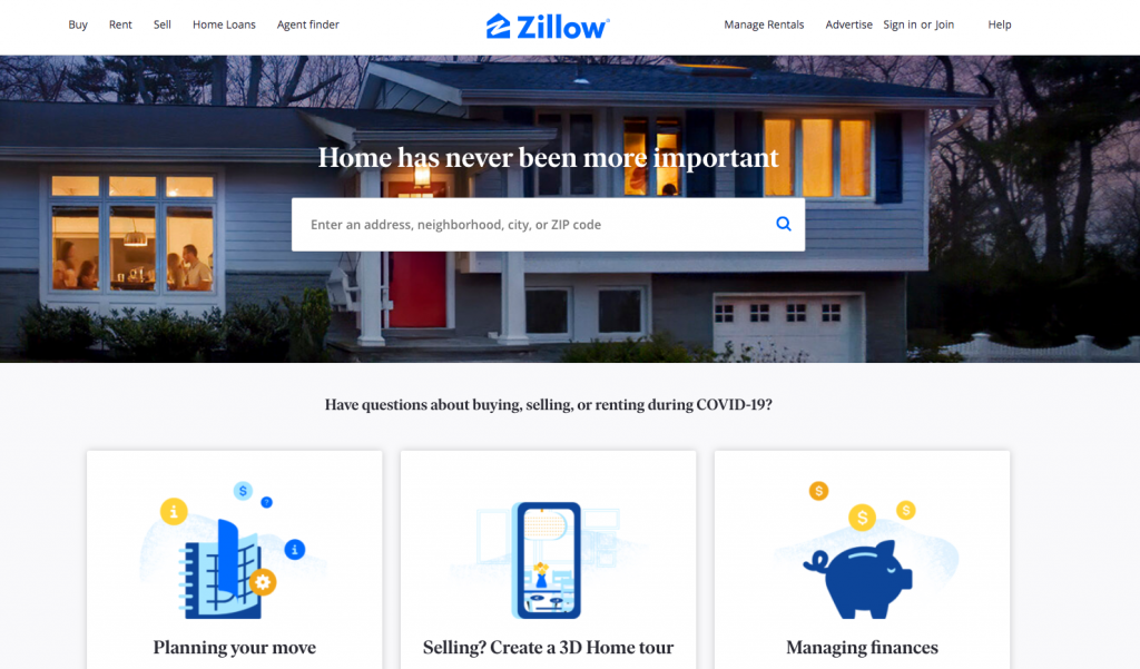
Here is another site that helps you find housing. The homepage of this site looks very convenient due to a large number of search settings. Having visited the main page, the user immediately forms an idea of what this company is doing.
The site is intuitive. This allows new users to immediately figure out how it works and without wasting time to start using it for their needs.
Dropbox (Business)
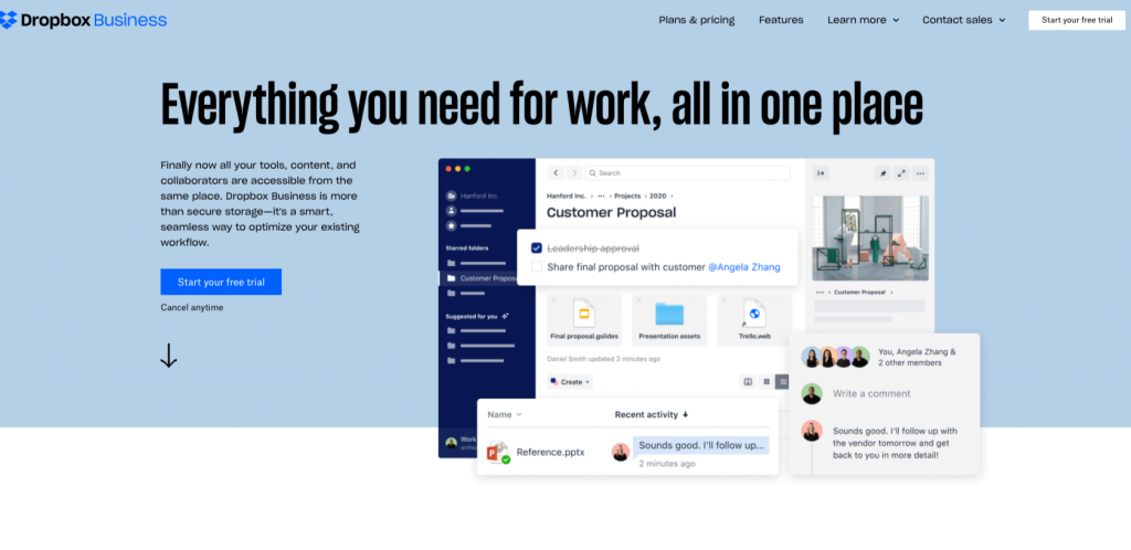
Dropbox is a great example of homepage design that attracts with its simplicity. It includes only what is important: a large relevant image with an auxiliary copy and a “Try it free for 30 days” button with a call-to-action. It will be difficult for you to get confused. Everything on this site is clear. The design of the homepage is simply brilliant.
Dropbox’s homepage and website are great examples of simplicity. Simplicity in homepage design is the main trend in 2020.
Visit this site for inspiration to create great homepage design.
Techvalidate
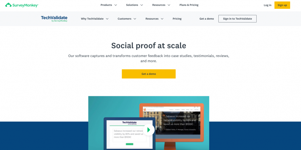
No doubt this homepage has a great design. This effect is created due to the successful use of spaces, contrasting colors and a design created with customer care in mind.
The headline is clear and understandable, as a call to action.
The structure of the homepage is excellent.
Kind snacks
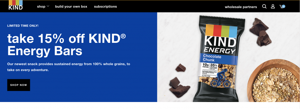
The design of this homepage is beautiful thanks to the successful use of colors and contrast.
CTA used skillfully. Visit this site and take a look at it.
The company’s tagline is memorable. The design of this homepage looks attractive. On this site, users want to spend more time. For these reasons, this design can be called good.
To make your homepage design better
Here we’ll talk about what you need to do or what to look for in order to make your homepage design better. Below will be described the main points that are worth paying attention to and which you should know about before starting the homepage design.
Headline
The title will tell the visitor of the site where he got to, what the company is doing and will give a brief idea about it. Already on the basis of the title, a person can understand whether the site and the activities of the company in general are of interest to him. Therefore, a concise and concise title should be required.
Unique selling proposition

Take the opportunity to pack all the buns and benefits of your customers in one unique selling proposition. You immediately get a huge advantage over your competitors, offering your customers what they cannot get elsewhere. A unique selling proposition is a great advantage that will help your business find loyal customers.
Navigation
The first thing a visitor should see after the heading of the main one is navigation to understand what sections are still on the site. Categories should be selected based on the content that the site will contain, as well as on the most important elements that will most interest the target visitor. It is important here to correctly develop the structure of the entire site in order to concisely organize folders into one large category with a short name. This is especially important for online stores. Structure is not only a form, it is also what makes your homepage design beautiful. Modern homepage design should be not only smart-looking, but also functional. And a good structure will help you achieve this effect.
Navigation can be two-level. Most often, this is the prerogative of large sites where navigation is needed on the primary information about the company and on its services or products.
The primary information may include the contact section, about the company, delivery information and the rest that the visitor will need to cooperate with the company. It is often made finer than the main navigation graph, which contains links to key categories.
Site search

Place the search bar at the top of the homepage, create search functionality by name, query or code, if we are talking about an online store and the goods are placed under codes, and you will see how much the usability of the site will increase and, at the same time, the convenience of its use by visitors. A good site search is your salvation. Learn to use it wisely, show how your users do it and your site will get another great advantage. The more benefits your site will have, the more confident you can expect a steady income.
Entrance to the private section
Logging into your personal account, a section for a particular category of clients, closed with a username and password, must be carried out directly on the main page. Take care of this so that your users can simplify further work with the site. It should be simple and convenient. Do not complicate login forms. Make them stylish. Let the login form stand out on your site. If users don’t see it, then how will they use it?
Images
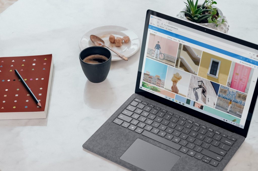
It’s absolutely unimportant that we are talking about an online store, a service site or an information portal, but images are needed everywhere and always. Themed, high-quality and attractive images support the general idea and concept of the page, make the homepage design brighter and help the visitor understand what exactly they are offered. Qualitative pictures help users to believe that your company is a reliable company with good products. Focus on the pictures. Users of 2020 love with their eyes. In the era of Instagram, this will remain a trend for a long time.
Calls to Action
In order to keep the visitor on the site and conduct it to the target action that we need, it is necessary to use primary and secondary calls to action. Any call that will help you attract the attention of a visitor and get him to go further to the site increases the chances of increasing the conversion. This is especially important for service sites, since often the main pages of such sites are quite long and capacious, therefore, with the help of calls to action, periodically posted on the main page, a visitor can make a targeted action at any time. Therefore, there should be several CTA resources on the main page of such resources. It is very important to observe this if you want to achieve a good result.
Benefit block
Blocks of advantages and benefits will allow a potential client to draw information and extract value that is important for him. Do not miss this element, take it into circulation in order to develop a winning strategy, attracting more buyers.
The advantages of a company is an important marketing element that directly affects business performance.
Subscription form
Subscribing to newsletters about promotions, special offers, updating content on the site and other information will help to keep the client and significantly develop the business. Therefore, be sure to place the subscription form on the main page. This can be a pop-up window or a static form located at the top of the basement or in a place where it will look logical and appropriate. For the best effect, you can use two options for placing the form at the same time.
It is important to understand that posting this form is relevant if company representatives are constantly engaged in email marketing. In other cases, it is useless.
Footer
The navigation contains the most important links leading to the site, which bring maximum benefit to the visitor. The rest can be placed in the footer of the main page. These are the links that do not carry the main value, but can help a person find additional information on the site that may interest him. Also, often in the footer are icons of social networks, contacts in micro-marking, technical information, a map, etc.
Conclusion

Now you have received a lot of information about why it is so important that your homepage design is great. You know what to pay attention to, and what does not play a significant role. Devote some time to this topic and delve into it. You will find many more useful tips of web design. And if you don’t have time for this, then you can write to our experts and they will share their experience with you.
In fact, this topic is worth writing a whole book. You can succeed in creating a homepage, but it all depends on many nuances. First of all, what you do is important. Each type of business has its own nuances that need to be considered. That is why it will be useful for you to seek the advice of our specialists.
If you decide to familiarize yourself with the topic of web design yourself, then we recommend that you read our other articles. In our articles, we are talking simply about complex things.
The list of best website homepage design examples helps you find a development vector. It’s easier to achieve a goal when you clearly know what it is. We hope this article has been helpful to you. Evolve. Experiment. Make your sites better, and users will appreciate it.


