What will be discussed in this article
In this article, you will see not only the best examples of landing page design but also learn the criteria that make them the best.
The main problem of most modern landings is that most of them look like copies of a copy. Of course, if your landing page is just a copy of an existing landing page, then it’s unlikely that you should expect a chance to get on our list. And yet, in this collection, our friendly team of professional designers gathered interesting sites with the best design. We hope that this article will inspire you, show you what to strive for in the field of web design and will be the first step in achieving the success of your company.
Get inspired and, of course, put your ideas into practice. You do not need to repeat everything step by step. You need to find your approach. Combine different elements, it’s easier than to create your own absolutely unique element. This is a great way. Experiment. Our design team will help you with this.
The power of time reflected in the design
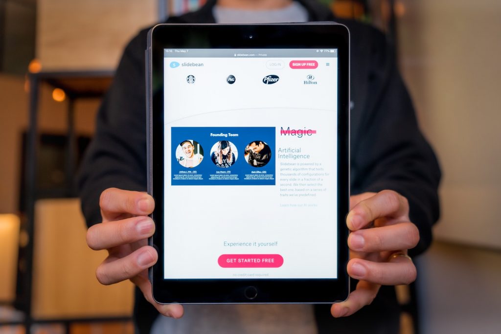
The first impression on the Internet is just as important as in real life. Since we give users many choices, their attention, passing through poorly designed landing pages, only decreases.
According to a joint study by Google and the University of Basel, users evaluate the aesthetic appeal and perceived functionality of a site in about 1.5 seconds. This is less than what is needed at the click of a finger. And during this time, the visitor decides whether to give you a chance or go to the competition. Naturally, this is an extremely valuable time. You should know how to use this time correctly. In this article, you will find some useful tips to help you take these 1.5 seconds correctly. But what does it mean right? This means that you need to take this time so that the average user wants to stay. The power of design is obvious here. Our tips will help you build strength.
Remember, you only have 1.5 seconds! During this time, you can click your fingers, or you can attract a new client with a cool design. The choice is yours. But if you choose to attract a client, then continue reading this article further.
One landing page is one goal
As you can see from the headline, a good landing page should only have one purpose. Stay focused on one goal. Be clear to the user. Express yourself simply and clearly. Follow the contents of your landing page. But before you start working on text or design, formulate the purpose of the landing.
Are you looking to increase conversion to sales, get user data, strengthen your brand, or achieve all of the above? Then approach each goal separately, in terms of design and development. Spend a little more time on this than usual, but you will see that this approach will bear fruit. And you will be satisfied, and your users.
The landing hierarchy determines its success. Therefore, it is important to determine the ultimate goal of the page when developing it. The structure is important not only on the landing page but also on multi-page sites. For this reason, it is important for you to ensure that the hierarchy is clear. Moreover, a good hierarchy makes the design more attractive.
Remember, different goals are different pages. The main goal will guide the development process and ensure that after launch you will immediately appreciate the effectiveness of the landing. Use this tip and you will see how many advantages this method has.
Write down everything you know about your customers

Step one. Decide on the purpose of your landing.
Step two.
What will be the second step?
Put yourself in the shoes of customers and think about what they want from the page? Why would they stay and do the target action? The more you know about the audience, the more likely the designer will create something that is relevant to her. Logically, the second step is to search for information about your target audience.
Often landing pages are unique to a particular audience segment or specific customers. This means that you should already know enough about them to give the designer a clear idea of whom the landing pages are aimed at.
You can read about how to correctly collect information about the target audience and use this knowledge in your work in our other articles or send us an email. We will be happy to advise you on this and other issues.
Stand out by design
It was mentioned above that you only have 1.5 seconds to get the user’s attention. Even the most professional text will not be read during this time. It remains to rely on the design. It is the design, not the content, that forms the first impression. And if you know about it, then you are armed. Use it wisely.
The first time you visit a site, you evaluate it from specific design patterns. You expect to see the navigation bar at the top or side of the drop-down menu in the upper right corner on the eCommerce website. If the resource does not meet these expectations, it is more difficult for our brain to read information from it and we automatically perceive it as inconvenient. Therefore, it is not always worth striving for uniqueness. There are things that must remain the same.
Of course, you can change the shape of the menu, but still, you should not skip the menu in an unexpected place.
However, when it comes to landing with one clearly defined goal, the following design standards can lead to unpleasant consequences. Unlike a multi-page site, the landing page has only one page. Web design experts say the homepage is the most important page. Well, in this case, the landing, which in essence has only a home page, is your only chance. Use it or lose it.
Another good tip

Remember this useful tip, focus on the user experience to turn users into customers. The real work begins when you grabbed the user’s attention and convinced him to stay on your landing page. Do you remember? Now get down to business!
List of best landing page design examples you need to see in 2020
Finally, we got to the list of best landing page design examples you need to see in 2020, which will show you what you should strive for. The best landing page design examples list will be your cheat sheet when it comes to practice.
Uber
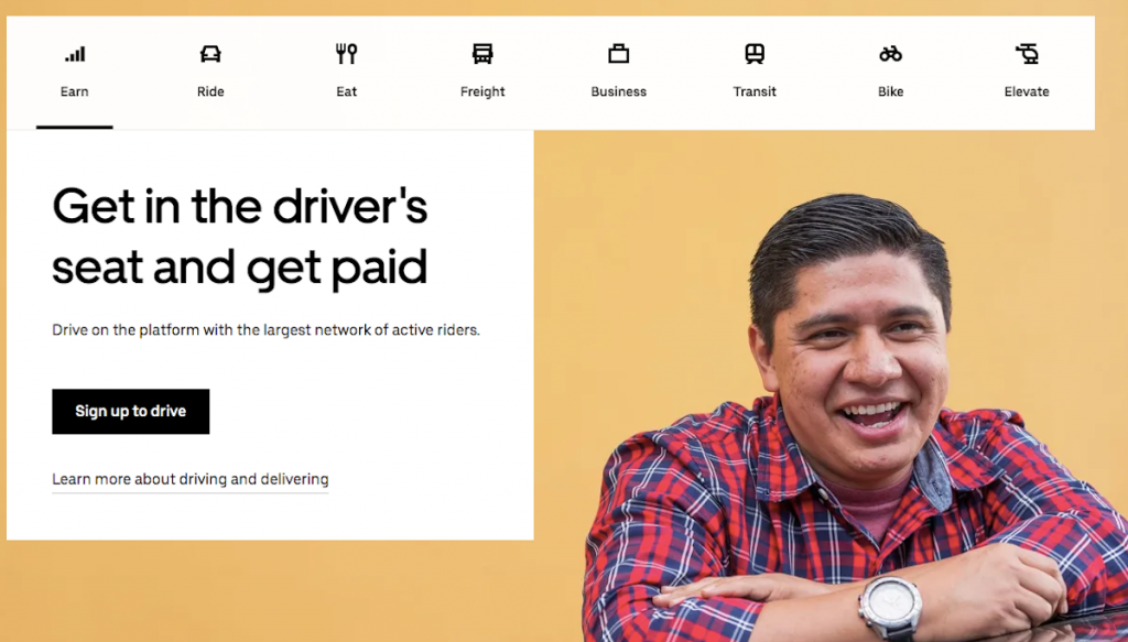
Look at this landing page. This is a great example that may inspire you. Everything here looks right and harmonious.
The heading of this landing page says that what really excites the user is the flexibility of the work schedule. Also, the form is placed high on the page. This has a great effect on conversion.
You will find on this wonderful landing three main reasons for the conversion, which are separately spelled out here.
In general, this lending page did well. Want to create the same for yourself? Do not copy, but be inspired.
Snapchat
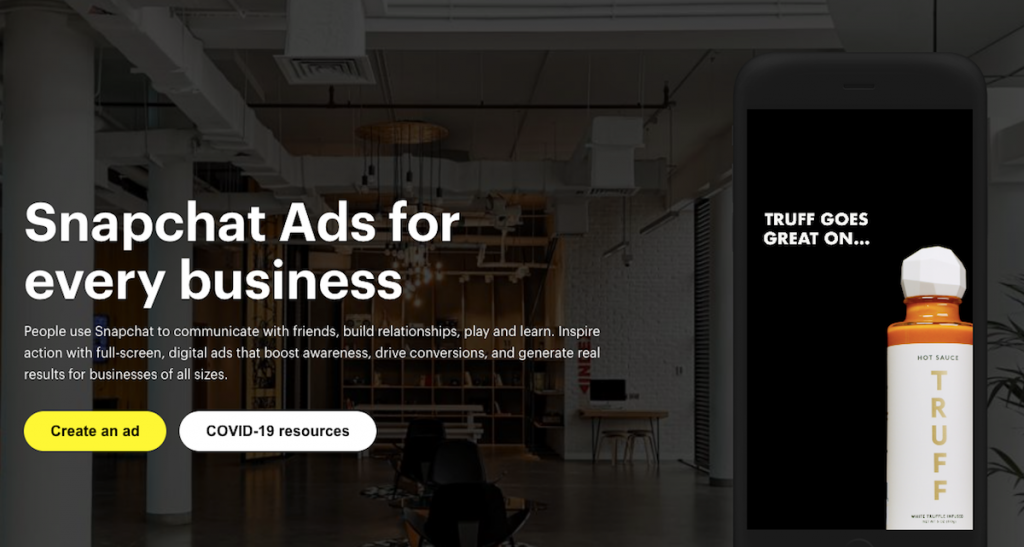
This is another example of a successful landing page. Here you will find high-quality videos. By visiting this landing page, you get all the necessary information. At a minimum, you remember what you get by agreeing to the conditions that are offered to you here. All this is very honestly formulated and does not cause a host of additional questions. This unambiguity is very important for the landing.
You also see the bold, signature use of color here. Yes, someone might have thought it was too bright, but these signature colors are associated with the company. Animated graphics to illustrate functionality work great, creating a cool effect. Visit this landing page and you will see everything with your own eyes.
Sticker Mule

Look at this landing page. Why do you think this is a great example?
The answer is simple. On this landing, dynamic animation is used, which has the task of attracting your attention. And the animation does an excellent job of this, right?
The call to action looks very appropriate here. It is well located and looks attractive. Of course, this landing page will have a high conversion rate.
You can also get more information by watching a video that looks very attractive.
In general, this landing page looks good. The first impression is wonderful. It is definitely worth your attention.
Masterclass
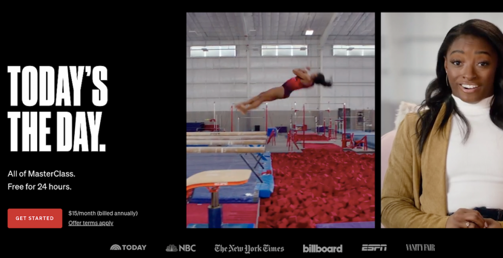
The video has also been used successfully. Take a look at it. It is very informative. You get the information you need in a cool way. Immediately you get an attractive offer.
The information does not end only with the landing page. Scrolling down, you will see links to social networks, where you can get more useful information. This is a great way to advertise a product or service.
This landing page looks stylish and informative. When these two qualities are combined in one landing, the landing automatically becomes one of the best. Keep this in mind when creating your own landing page.
Litmus

The title of this landing is friendly and personable. This is very important because the tone of this headline sets up the user for a friendly conversation. And in such an atmosphere, the chances of a large conversion rate increase significantly.
Also, the form of this landing is very simple. It has only one field. This suggests that the site will not request unnecessary information. It also shows that the company cares about the time of its users and treats them with respect.
Of course, the landing page is informative. Visit this to create your own impression.
Contently
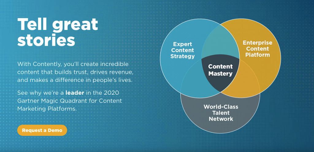
The main feature of this landing page is a pop-up window. Yes, pop-ups are bad practice and most often it infuriates users, but not in this case. Here the designers did their best.
The minimalistic design of the landing page highlights the button. Minimalism has long been popular. This will remain popular in 2020. This landing page is a wonderful example of how you can use minimalism in your project.
Visit this landing page to understand what features you like and what you yourself would like to borrow.
Basecamp
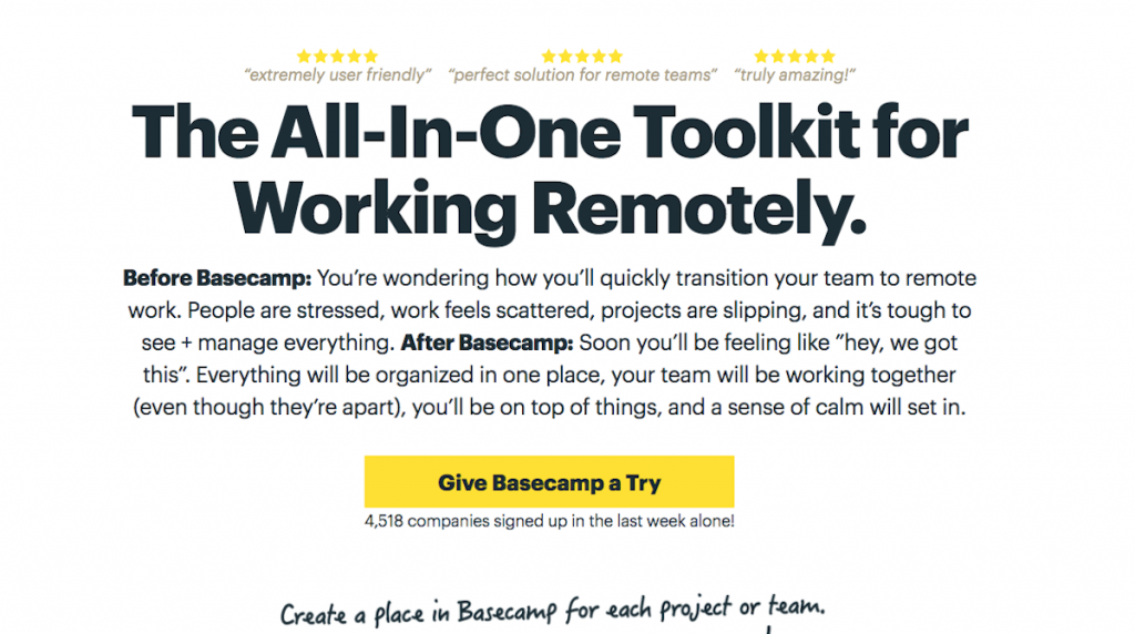
This is another example of minimalism, with the addition of an animated character. It looks nice and inspires confidence among many users. And yet, if you have to choose between user confidence and style, it’s better to choose the first, because it is obvious that this will affect the conversion in the best way.
The headline uses social proof, telling you how many companies have registered in the last week. People love numbers, and the fewer users understand statistics, the more they like it.
Codecademy

The design looks simple, but there is a lot of work behind this simplicity.
The title is clear and understandable. The design emphasizes the elements that are worth paying attention to. This effect is not always easy to achieve, but if you succeed, then we can say that this is a success.
It is not necessary to register here, because the function of logging in via Facebook or Google+ is available, which reduces the barrier to conversion. This is also a very big plus, which will give good results.
The video used in this landing tells about the benefits that the user can get. But this information is not told by the company representative, but by the client. This is also a good move. Together, all this makes the landing page a great example.
Shopify

To reduce doubts and increase user confidence, this landing page uses a good headline and statistics that will convince even the biggest skeptic.
The video presented on the landing page talks about the advantages of Shopify, which is an excellent step because it allows you not to read a lot of text.
Also, the form requests only the most necessary, which is an advantage.
Call to action uses contrast that clearly attracts attention. Pay attention to the little things. Here they are thought out.
On the way to creating a great landing page
Successful landing is a living organism. And this living organism is constantly changing. For example, a couple of years ago, a typical feature of landing pages was the use of aggressive marketing and a constant call to action. Buy it now! Hurry up to order! And all in the same vein. But time is changing, and with time, the way your landing page looks is changing. This is if you really care, and you want to create a great landing page that will help you achieve your goal. And we remember that your goal should be one on one landing, no more.
Measuring and exploring data is the way to maximize the benefits of your campaign. And although you already know that the key metric of success is based on the first paragraph of the article, which states that one landing is one goal, you can track other indicators to understand whether the design helps or hinders the target action.
If your landing page has a low conversion, there can be many reasons. But most likely, you are not giving users the right information or highlighting the value. Sometimes mistakes are in the details and therefore difficult to find. For example, too long a form of capture or too much information on the landing page. You begin to see such nuances with experience. If you need an experienced designer, contact our agency and we will select an excellent specialist for you.
A good landing design consists of five aspects:
- Understanding the most important goal of the page (one landing is one goal);
- Understanding the ideal customer;
- Unique design that attracts attention;
- Amazing conversion-inducing experience
- The ability to track and measure user actions.
Remember that landing pages should not be created using templates. Each of them must balance between the goals of the business and the needs of the audience. It’s time to experiment. Do it wisely.
Bottom line
Now you know the basic criteria that make landing a cool example worthy of imitation. Therefore, you have the opportunity to create such a cool landing page that will fall into our list of cool landing pages next year. Strive to be better, create more and dream big. Let the landing be just the beginning in your long journey.


